Removal of bottom margins
Before v7, some components had both top and bottom margins. This made the default spacing between them hard to predict, because those margins would either stack or collapse depending on the combination of components and how the HTML around them was structured. To make default spacing between elements less confusing and more consistent, we've limited our margins between components to one direction. Components now have only top or left margins, depending on whether they are block or inline elements. Notably, this is how the U.S. Web Design System approaches spacing. In this version, the following components have had their bottom margins removed:
- Choice (check/radio)
- Choice list
- Choice checked children
- Date fields
- Multi-input
- Single-input
- Dropdown
- Lists
- Month picker
- Paragraphs
- Text field
- Review
If the gap below these components disappears in your application when upgrading, consider adding margin above the next item or adding it back in if you previously had to remove it.
Spacing above zero-margin components
Please note that some components in the design system have no default spacing around them because the context in which they're used can be varied. If you relied on any of the components in the list above to provide space before these zero-margin components, you'll need to add your own top-spacing to the zero-margin components that come after them. These zero-margin components are:
- Accordion
- Alert
- Button
- Horizontal rules (
<hr>) - Icons
- Pagination
- Spinner
- Table
- Tabs
Note that headings were not included in this spacing update.
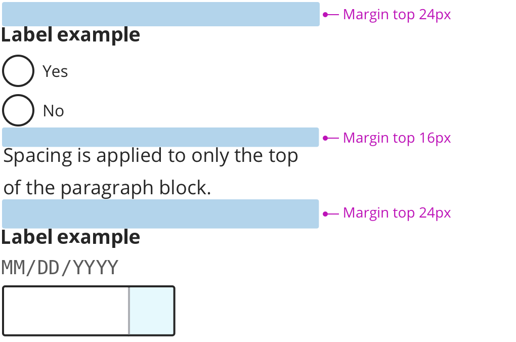
Example of margin collapsing and stacking
While margin collapse is an understandable concept, it is prone to producing unexpected results, especially when translating from designs to code. Consider the following annotated screenshot which shows the default spacing between a sample of components in the previous version:
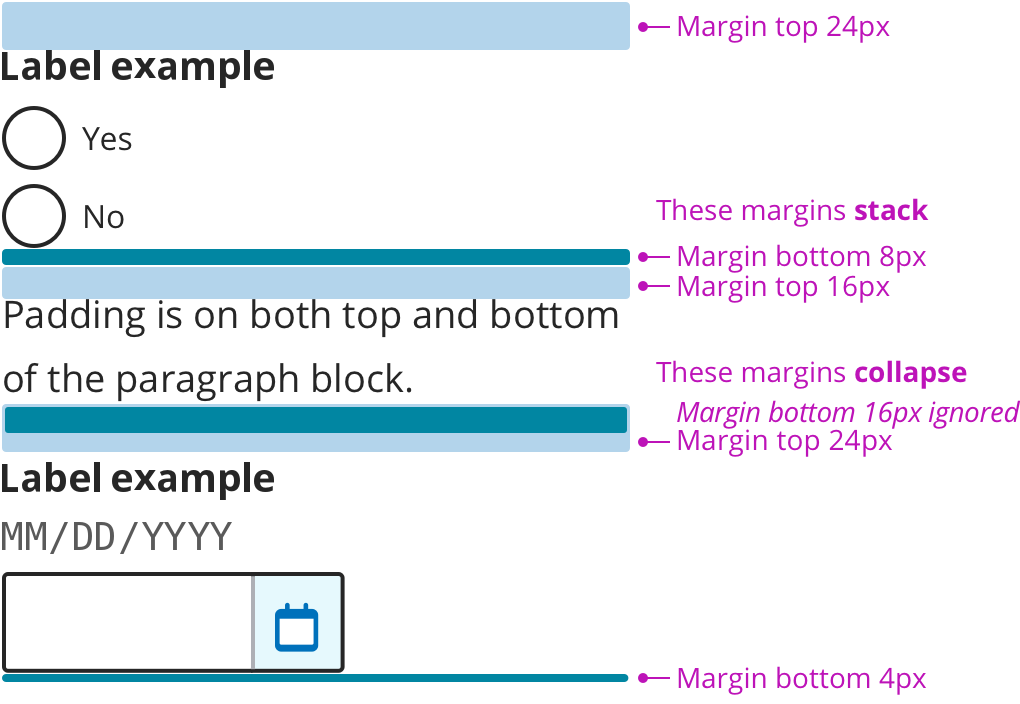
In the above screenshot, notice the inconsistency in how spacing between elements is determined. Between a choice list and a paragraph of text, the margins stack, causing there to be a total of 24 pixels between them. Between a paragraph of text and a field label, the margins collapse, causing it to take the higher value of the two, which is 24 pixels. There are also 4 pixels of padding below the last field. Compare this with the following "after" screenshot where all spacing comes from top margins: