 Figma
Figma Storybook
Anatomy of recommended error validation
Use the Validation on Submit pattern for most use cases. Use Instant Validation when the answers aren't obvious or when input fields are difficult to complete.
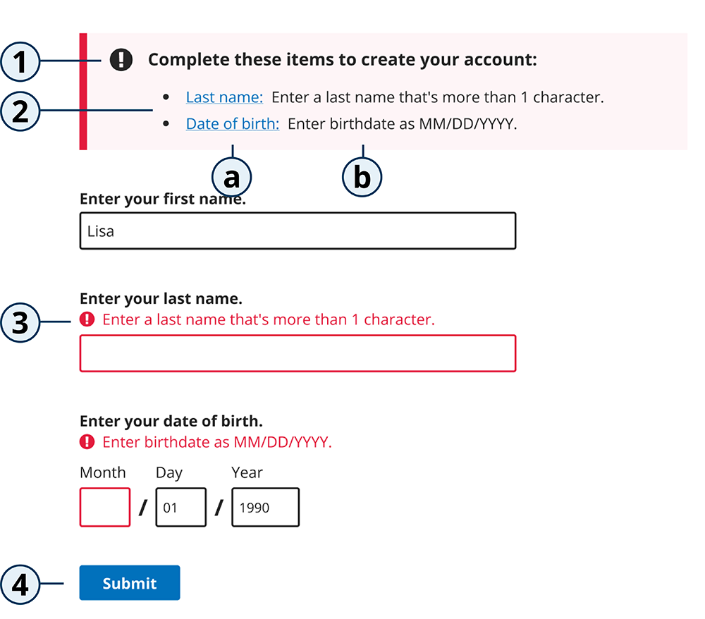
1. Summary error heading
- Content helps frame the information in the alert and reminds the user of what they're trying to accomplish by fixing the errors.
- Always end in a colon because it's leading into the bulleted list of items to fix.
- Recommended heading content is "Complete these items to..."
2. Summary error list
a. Error link
- Include bullets for each item listed.
- Link to corresponding input fields via an
aria-describedbyattribute on the input.- When a user has to enter their answer into multiple fields, such as the day, month and year fields in the date input component, link to the first field that contains an error.
- For questions that require a user to select one or more options from a list using radios or checkboxes, link to the first radio or checkbox.
- Link text should match the field title.
b. Error description
- Use the same language as the inline error message.
3. Inline error
- Content used for inline error messages will also appear in the summary error description.
- Inline error text should be outside of the label element.
- Inline error messages should be linked to their corresponding input fields via an
aria-describedbyattribute on the input.
4. Active submit button
- Buttons at the end of forms work best with clear labels that reflect the overall user goal. Examples: "Submit" or "Submit application"
- The buttons on the bottom of other pages in a multi-page form should read "Next" or "Continue".
- Do not use disabled submit buttons. Allow the user to submit and then receive guidance through error summary and messages.
Guidance for all errors
Do
- Use the Validation on Submit for most use cases. Use Instant Validation when the answers aren't obvious or when input fields are difficult to complete.
- Inline errors are built into all design system form fields but can be used on their own to create custom fields. See Inline Error for more information.
- Inline errors should sit either directly above or below the input, depending on the current theme defaults:
- In the CMS.gov, Medicare, and Core themes, errors appear above the input.
- In the Healthcare theme, errors appear below the input.
- Visually align inline validation messages with the input fields so people using screen magnifiers can read them quickly.
- The form field should have an
aria-describedbyattribute that references theidof the error message. - Use color as a secondary way to draw attention to an error. Do not rely on color alone to indicate an error.
- Include icons and messaging for each error field.
- Place an icon in front of an error to draw attention to an error.
- Hide the error icon from assistive technology by using
aria-hidden="true"and provide screen reader text to indicate an error ahead of the error message, typically done with "Error" as the screen reader text.
- Hide the error icon from assistive technology by using
- Build your error message guidance alongside the form fields and form content, not as an afterthought.
- Test to validate that users understand what went wrong and how to fix it.
Do not
- When using choice children, do not use the error alert. Error messaging should be implemented with the error summary and inline error.
- Do not use the warning alert if the error needs to be fixed for the user to continue.
- Do not exceed 6-9 form fields on one page. If many inputs are in an error state, the list might be unmanageable for the user.
Error message content
An error message, in both inline errors and error summaries, must include what the user can do to fix the error.
- Inline errors only state how to fix the issue so the user completes the field correctly.
- Summary error messages include introduction text that reminds the user what's needed in order to complete the action. It also lists the fields to fix and their corresponding inline error messages—the exact same content should be used for the field title and inline error message.
All messages must:
- Be specific, short, and consistent.
- Be in plain English/plain language.
- Use imperative style (give a direct command to the user).
- Specify what the user needs to do to fix the issue (using positive framing).
- Give enough detail to help the user solve the problem or continue to the next step, while using the fewest words possible.
- Examples:
- "Enter a 10-digit United States phone number."
- "Enter an email address with @ symbol and email domain, like ".com"."
- "Enter birthdate as MM/DD/YYYY."
- Examples:
- Use a single error message when there are multiple fields related to the same thing, like date (month, day, year).
- Use sentence case.
- End with a period.
- Include language from the question or fieldset label—this helps match up the error message with the relevant form field.
- Example:
- Field label is "Street address." Inline error message is "Enter a street address with building number and road name." Both the label and error message include "street address" for better user comprehension on how to fix the error.
- Example:
- Sound human—read the message out loud to see if it sounds like something you would say.
- Test error messages to validate that users understand what went wrong and how to fix the error.
Avoid the following in error messages:
- Don't be too generic: General error messages don't help the user to fix the problem.
- Examples:
- "An error occurred."
- "Answer the question."
- "Select an option."
- "Required field."
- Examples:
- Don't use the verbs "see" and "view" unless it would be awkward to use another verb. These can be used, but they should be the last choice (accessibility issue).
- Don't use words like "please" or "sorry," or informal language like "oops."
- Don't use technical jargon like, "Unspecified error," and "Issue 567 error."
- Don't use negative words like, "forbidden," "illegal," "you forgot," "you didn't," and "prohibited."
- Don't use "valid" and "invalid," as these words can mean a lot of different things and are not commonly used words for non-native English speakers.
Validation on Submit (default)
This is the recommended type of error validation for most use cases.
Validation on Submit uses the error summary message and inline errors to provide a clear list of errors after "submit" is clicked. When errors are found, feedback is returned and displayed to the user in an error summary at the top of the page with corresponding inline messages next to the incorrect fields. This allows users to fill out the form without interruptions and guides them in finding and fixing errors.
The Validation on Submit pattern is composed of an error summary, form fields, and an active button.
When to use
- This is the preferred style of error validation and should be used in most cases.
When to consider alternatives
- Use Instant Validation only if your user research shows that it solves more problems than it causes. This should be limited to very specific and short use cases. For example, single, complicated form fields, such as creating secure passwords, can benefit from instant validation.
Do
- Perform validation on all inputs when the button is clicked.
- Show an error summary at the top of the page. Always show an error summary when there is a validation error, even if there's only one.
- Show appropriate error messages next to the correlated field label and in the error summary.
- Break down forms into smaller sections. Keep the maximum number of form fields to 5-9 on one page. If many inputs are in an error state, the list might be unmanageable for the user.
Do not
- Do not clear any form fields when validating users' answers. Keep both passing and failing answers. This is to comply with WCAG 2.2 success criterion 3.3.7 Redundant Entry. Keeping information that failed validation helps users to see what went wrong, edit their previous answer, and avoid re-entering information.
- Avoid using disabled buttons by default on page load. It is preferred to show users an error message when required inputs aren't provided.
- Do not exceed 6-9 form fields on one page. If many inputs are in an error state, the list might be unmanageable for the user.
Accessibility
- Place error summary below the
<h1>and above the form fields. - Shift focus to the error summary heading at the top of the page and use the
aria-labelledbyattribute to give it an accessible name. This should not be in the tab order and it also should not include a visible focus ring. - If the page is reloaded on form submission, add "Error: " to the beginning of the page
<title>.
Screen reader testing
- When the input field gets focus, its label should be read first and then its hint (if it has one) and its error message.
Examples
Error summary
Single error
Multiple errors
Instant Validation
Instant Validation, or dynamic validation, shows an inline error next to the incorrect field after the user has moved focus away from the form field. This allows the user to fix the error immediately rather than after the form has been submitted.
Instant Validation should be implemented carefully and in appropriate cases because it might be distracting if overused or misused. Only add Instant Validation if your user research shows that it solves more problems than it causes. This should be limited to very specific and short use cases. When used appropriately, Instant Validation can greatly reduce cognitive load of the user by avoiding the task of locating the incorrect input.
When to use
- Use Instant Validation when the answers aren't obvious or when input fields are difficult to complete. For example, single, complicated form fields, such as creating usernames or secure passwords or confirming email addresses and dates.
When to consider alternatives
- When in doubt, default to Validation on Submit. Instant validation should be implemented carefully and in appropriate cases because it might be distracting if overused or misused.
- Use Validation on Submit for services which cannot use JavaScript for dynamic approach.
Do
- Wait until a user has moved focus away from the form field before raising an Error Message.
- Display error messaging after a user has changed the value of a given field and has moved focus away from said field.
- Raising error messages after a user has changed the value of a field prevents errors from appearing if someone is tabbing through fields to gain context of what information is needed.
- Premature error messaging can confuse users if they already know what they need to do.
- Error messages are removed as individual fields are corrected.
- Upon all individual errors being corrected, the general error message is removed.
Do not
- Do not raise an error message before the user has moved away from the form field. Premature error messaging can confuse users if they already know what they need to do.
- Avoid use of dynamic validation for multiple form fields unless needed for multiple complicated form fields.
Accessibility
- Include an
aria-liveattribute value of "polite" so that the validation is presented by the screen reader after the user has completed all queued announcements.- For requirement criteria with dynamic hint iconography (for example, updating with "checkmark" or "X" icons as the user sets a password), images should be hidden with the
aria-hiddenattribute. Each list item should utilizearia-live="polite"andaria-atomic="true"attributes so the entire line of criteria gets announced when updated.
- For requirement criteria with dynamic hint iconography (for example, updating with "checkmark" or "X" icons as the user sets a password), images should be hidden with the
- If the input is invalid, we will set the
aria-invalidattribute, add an error message directly below the input, and announce the error to the user. - Remove an input's associated error message once the error requirement is met.
- Error messages should be linked to their corresponding input fields via an
aria-describedbyattribute on the input.