The CMS Design System v4 release introduces an updated button architecture that is not backward compatible with previous versions of the design system.
Previous button architecture
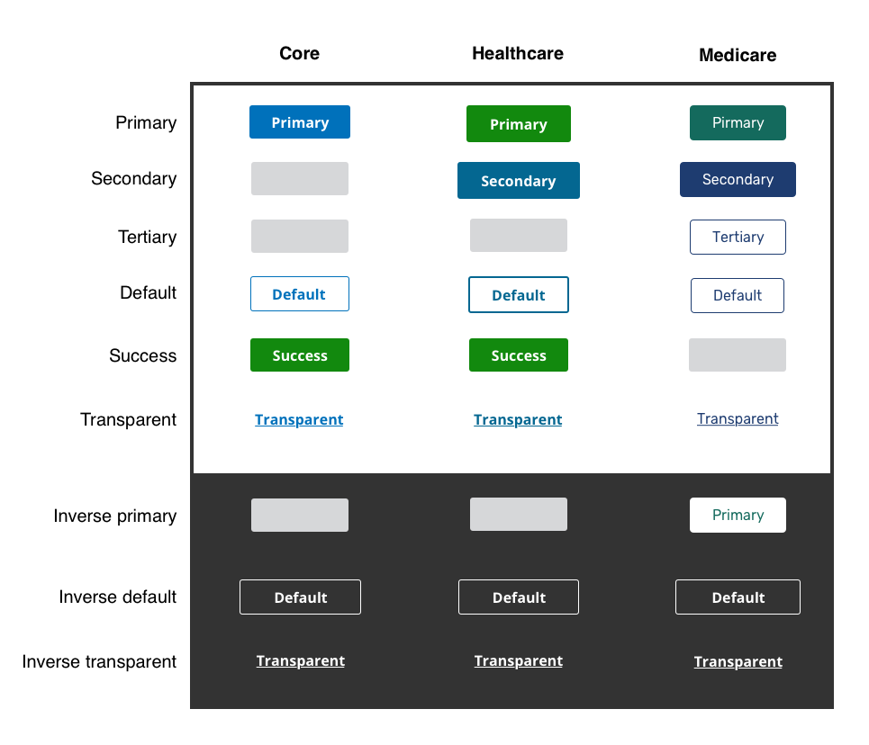
The previous implementation of the design system button architecture varied between the core design system and child design systems. The structure did not provide a consistent approach to buttons and did not take into account the potential for "on dark" variations of all buttons.
There were button types and styles that existed in child design systems only and were not available in the core design system creating a siloed model where updates and improvements to buttons could not be made to the entire system. In addition, the language used for buttons varied throughout the system. Names such as "primary" and "secondary" were confusing and inconsistent because they were not mapped to primary or secondary brand colors.

New button architecture
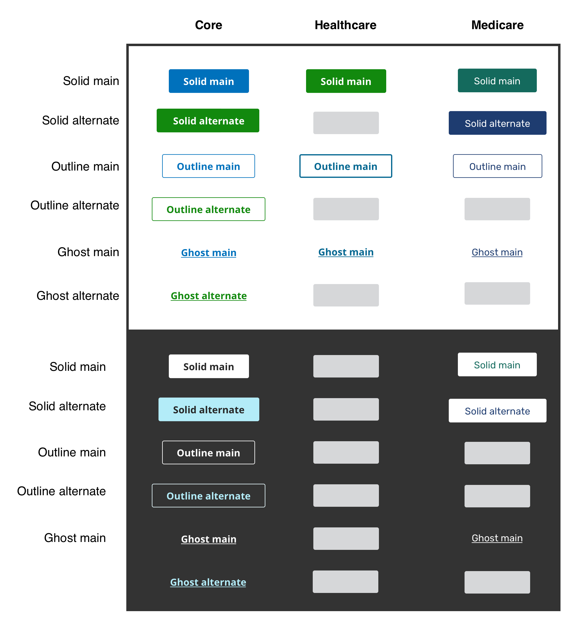
The updated button architecture creates a more robust and full-featured set of buttons with multiple color options for each button style, in addition to a full set of "on dark" button variations. The updated approach to language and naming is based on the style of a button (Solid, Outline, Ghost) rather than the priority of the button (Primary, Secondary). This allows themes to define button usage and button priority within theme level guidance and documentation. This approach keeps our language for consistent across the design system and themes for everyone as we move towards a unified design system that can be themed by brand.

Use the theme selector in the left navigation to see what buttons are available for child design systems.
| Variation | Main (Default) | Alternate |
|---|---|---|
| Outline (Default) | ||
| Solid | ||
| Ghost |
| Variation | Main (Default) | Alternate |
|---|---|---|
| Outline (Default) | ||
| Solid | ||
| Ghost |
Updating your design in Sketch
Sketch button structure updates
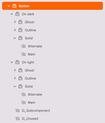
The updated button structure in Sketch will be organized into 2 main groups on light and on dark and then from there will be categorized by style of button - solid, outline, and ghost. For each style of button there are main and alternate options available.

The Ω_Unused and Ω_Subcomponent folders are for categorization only
These folders contain elements that are not used within the theme and appear at the bottom of the button folder structure.
Sketch button layer style updates
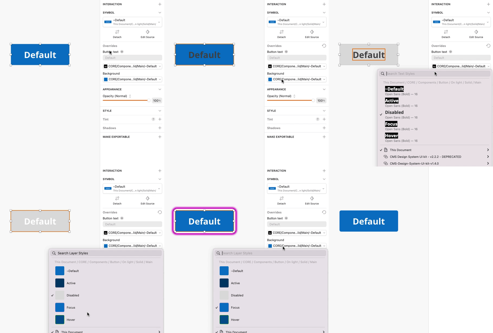
We've updated our buttons in Sketch as well to take advantage of layer styles and text styles for various button states. This means we are only providing the default or resting state of each button variation and then if you need to create a button in a focused state or a button in a disabled state you can easily swap the layer and text style for the button to achieve the state you are wanting to use. The text and layer style names should match - For example, the focus text style will match with the focus layer style to style the button in a focus state.

Sketch button icon updates
We've added button icon variations to the default button. You can now add buttons with left and right positioned icons to your designs and use Sketch symbol overrides to change your icon inside the button.
Updating your code
Mapping old buttons to new buttons
We have provided automatic migration scripts as part of this migration guide, however it is helpful to know how the old button variations in your app are mapped to the new button architecture. The following tables show how to map buttons defined in React code or plain HTML with CSS classes.
Use the theme selector in the left navigation to see what buttons are available for child design systems.
| Looked like | Old React | New React |
|---|---|---|
<Button... | No change | |
<Button variation="primary"... | <Button variation="solid"... | |
<Button variation="secondary"... | <Button variation="solid" isAlternate... | |
<Button variation="transparent"... | <Button variation="ghost"... | |
| [Success] | <Button variation="success"... | Alert: Deprecated - Consider using solid variation |
| [Danger] | <Button variation="danger"... | Alert: Deprecated |
<Button inverse... | <Button onDark... | |
<Button variation="primary" inverse... | <Button variation="solid" onDark... | |
<Button variation="secondary" inverse... | <Button variation="solid" isAlternate onDark... | |
<Button variation="transparent" inverse... | <Button variation="ghost" onDark... |
| Looked like | Old HTML | New HTML |
|---|---|---|
<button class="ds-c-button"... | No change | |
<button class="ds-c-button ds-c-button--primary"... | <button class="ds-c-button ds-c-button--solid"... | |
<button class="ds-c-button ds-c-button--secondary"... | <button class="ds-c-button ds-c-button--solid ds-c-button--alternate"... | |
<button class="ds-c-button ds-c-button--transparent... | <button class="ds-c-button ds-c-button--ghost"... | |
| [Success] | <button class="ds-c-button ds-c-button--success... | Alert: Deprecated - Consider using solid variation |
| [Danger] | <button class="ds-c-button ds-c-button--danger... | Alert: Deprecated |
<button class="ds-c-button ds-c-button--inverse" | <button class="ds-c-button ds-c-button--on-dark"... | |
<button class="ds-c-button ds-c-button--primary ds-c-button--inverse"... | <button class="ds-c-button ds-c-button--solid ds-c-button--on-dark"... | |
<button class="ds-c-button ds-c-button--secondary ds-c-button--inverse"... | <button class="ds-c-button ds-c-button--solid ds-c-button--alternate ds-c-button--on-dark"... | |
<button class="ds-c-button ds-c-button--transparent ds-c-button--inverse... | <button class="ds-c-button ds-c-button--ghost ds-c-button--on-dark"... |
Migration scripts
Migration help has been provided via the cmsds-migrate helper script. If you include the @cmsgov/design-system@ver package in your project the script is usable by executing the following command from the command line:
yarn cmsds-migrate or npx cmsds-migrate
After executing this you will be provided with a list of migration modules to utilize which are named descriptively by function, like this:
 file:
❯ html button migration
  migration notice cleanup
  react button-migration
If your project is written in React, use the react-button-migration option; if you use plain HTML with CSS classes, choose the html-button-migration option. After choosing a migration configuration, the script will search your current working directory for files that match the pre-defined rules for migration, and it will present a description of the changes to occur. Finally, it will list all the files to be modified, and after verification by prompt, it will execute the migration. Please be sure to only run these scripts in a git repo where changes can be backed out if incorrect. For cases that require some additional human attention, the script will place a comment near the change that it made. These comments can be cleaned up automatically using the migration-notice-cleanup migration configuration.
There are a number of command line options available by passing the flag --help. These include the ability to provide the current working directory, add additional ignore globs, force execution without prompting and pass an arbitrary configuration module to the script. The list of configuration modules provided is stored in the @cmsgov/design-system package under scripts/cmsds-migrate/configs.