We know that Open Enrollment is just around the corner for both Medicare.gov and HealthCare.gov teams, so this update is intentionally light. We don’t expect most teams to have to change anything in this major release. We did mark a few breaking changes because they are either “breaking” in principle or have the potential to cause unexpected changes. We lumped those changes into a major release to make sure teams are paying attention to the upgrade. We hope this release gives teams more flexibility and at the same time helps them create more consistent experiences as we head into fall.
What's new in 8.0
The HealthCare.gov header gets a USA banner
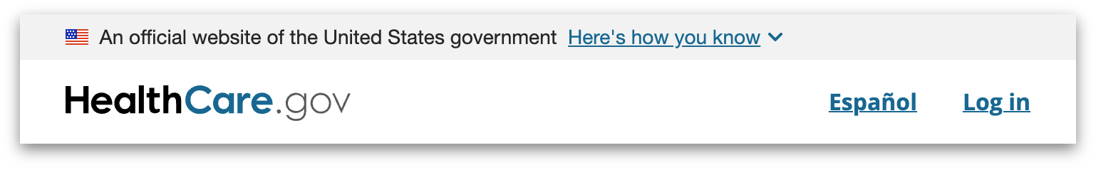
To make HealthCare.gov compliant with government standards and increase trust with consumers, its shared header component will now have the USA Banner built into it. To help coordinate a synchronized release of this banner on all applications at once, we’ve included a prop that teams can use to show or hide it.
The Medicare.gov footer says goodbye to its glossary link
Medicare.gov is discontinuing its glossary page, so we’re removing the link from the footer. Teams that implement their own footer are responsible for removing it in their own applications.
Along with this change are some refreshed footer styles that clean up layout issues, especially on mobile, and simplify the CSS. Teams that implement their own footer are encouraged to adopt these new styles and markup changes.
Improved VoiceOver + Safari support for Autocomplete and Dropdown
VoiceOver support for our Autocomplete and Dropdown components has not been as robust as it could be. The method used to fill in VoiceOver’s lack of standards compliance has been somewhat unreliable and leaves something to be desired in the user experience. In order to remedy this, we’ve moved away from using the Downshift library to a solution that is better supported by VoiceOver while maintaining strong support from other screen readers. More details can be found in our code release notes.
What's on deck
Piloting our web components
In the previous release, we started offering an experimental subset of our components as framework-agnostic web components. In the months leading up to the new year, we will be piloting these components with a couple of teams. We'll learn and iterate on them, and we'll also apply what we've learned to the next batch of web components that we make.
Updating design files
We’re narrowing the divide between design and code by addressing a significant backlog of design issues. This effort aims to provide a more accurate representation in all our UI Kits.