Have ideas?
What's new in 6.0
First-class support for non-Sass projects through CSS Custom Properties
Previously we had two options for teams consuming our design system styles: CSS and Sass. Importing our Sass files was the only way to gain access to useful design-system variables like color and spacing tokens. Projects that used CSS only had to hard-code things like primary color into their projects. Over this program increment, we shifted to using CSS Custom Properties throughout our stylesheets, and now we can pass those custom properties on to product teams.

With this move, as we mentioned in our previous blog post, we've decided to stop distributing a Sass version of our stylesheets in our npm package, but we are still providing Sass files with the Sass versions of all our theme variables while teams transition over to using CSS Custom Properties. You can read about how to use the CSS files and our theme variables in our getting-started guide for developers. If you're currently using Sass, we've put together a more detailed Sass to CSS migration guide for you.
New masked fields and automatic SSN obfuscation
When we created the single-input date field a while back, we introduced a new masking pattern called the label-mask. Now that we've been using it internally for a few months, we've decided to open it up for use as a drop-in replacement for our old input-mask pattern. The label-mask now supports every feature that the old input-mask supported, with the additional improvement that the Social Security Number (SSN) field now automatically obfuscates the SSN when the input doesn't have focus by only showing the last four digits.
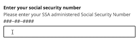
Hiding the SSN is previously something application teams had to implement themselves to use the SSN field and maintain their users' privacy. You can read more about the label-mask pattern—what it is and why we built it—on the new documentation page.
Sunsetting InVision DSM
Back in 2020, we started using InVision DSM to capture specific documentation and guidance in addition to the documentation sites. InVision DSM allowed for more non-technical users to contribute documentation and guidance to the design system. The DSM solved one problem of allowing team members an easy way to create and update content. In addition, the DSM has proved that making it easier to update and maintain content using a WYSIWYG-type editor is helpful for the design system. We made a lot of good progress in collaborating on specific Healthcare and Medicare guidance for product teams.
However, the DSM also created divergence in several important areas:
- Child design systems didn't inherit content from core
- Contributors were writing the same content multiple times
- Product teams need to visit multiple sites to consume necessary guidance
- DSM guidance and code library fell out of sync
- Two different groups were responsible for updating two different doc sites (devs & designers)
- Engineers favored GitHub-based doc site for its parity with code, while designers looked to the DSM for up-to-date guidance
For these reasons we decided to migrate all the content from the DSM into our documentation site design.cms.gov and with this release have completed that effort and are sunsetting the DSM! This moves us closer to our objective of having a single source of truth for the design system. We will continue to work on sunsetting related legacy sites like assets.cms.gov and styleguide.healthcare.gov in the future.
System Color tokens
In our 3.6.0 release we established design tokens for the design system including system color tokens. System color tokens are the complete set of color tokens from which themes are built.
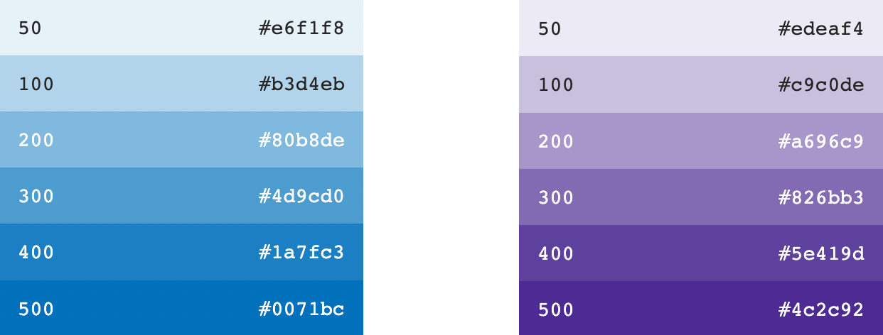
In this release we've added a page to the design system to show all color tokens in an easy-to-read and scannable way. We're exposing this base set of tokens to better highlight the design decisions made within a particular theme. Think of them as a complete box of crayons. Our themes make use of certain colors from the crayon box but not all of them.
Streamlining the ZIP Code design pattern
We dove deep into a dozen CMS, HealthCare, and Medicare products, and what we discovered was truly eye-opening. We found a wide range of design patterns used for ZIP code input fields, but we also found some commonalities that can lead to a more efficient and user-friendly experience.
Some products used a 5-digit ZIP code pattern, others used a 9-digit ZIP code pattern for stricter data validation. We also discovered services using an autocomplete feature for users to confirm their geo-location.
ZIP codes are an important part of how we search for services and determine eligibility at CMS. Overall, we're thrilled to bring these design insights to the table and excited to see the impact they'll have on our user's experiences. See ZIP code pattern guidance.
Sketch layer order
For many people, the New Year inspires lofty goals that, through time, eventually get neglected.
Designers can fall into that same trap. We want to label and organize every layer in a file but, eventually, cracks emerge.
In this non-breaking change, we shook the proverbial rug out in all three UI Kits, neatly re-aligned their categories, and listed layers alphabetically from top to bottom.
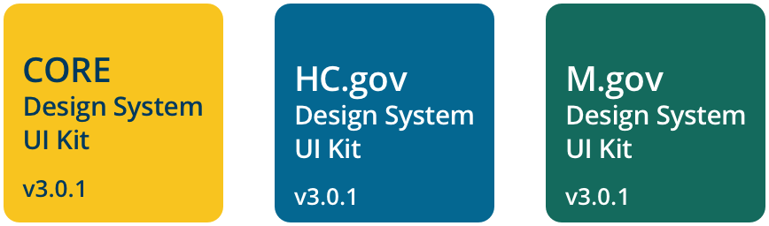
Oh, and we added some fancy new thumbnails to the files to help visually separate them in Sketch cloud! Check out our “New Years Fresh Scent” Design System 3.0.1 UI Kits.
What's on deck
Future font updates
The design system team is turning its attention towards improving our font offerings. Our goals in this initiative are to…
- Allow font sizes to adapt to user preferences
- Improve performance with a variety of operating systems under poor network conditions
- Treat fonts and their utilities with more consistency across our design system themes
- Streamline the design process and expedite decision-making as it relates to fonts
We've recently finished some promising rounds of discovery and auditing, which move us closer to achieving these goals. One major change that product teams can anticipate is a shift from absolute units (px) to responsive units (rem) for font sizes, which will finally respect browser settings. We're excited to share more about these changes in the coming months!
Built-in CSS reset
We recently published an RFC analyzing the use of CSS resets by product teams and how we might do more on our side to create consistency and make it easier to use our design system as-is. We're going to work on an experimental reset of our own that is baked into the design-system styles, and we will release a preview to application teams so they can provide feedback. If all goes well, we'd be looking to release a final version in June.
Removing deprecated i18n props
Back in April of 2022, in our 3.3.0 release, we introduced a new way of handling internationalization in the design system, and we soft-deprecated props for setting the language on individual components. In our next breaking-change release, we will be removing those deprecated props for good. They are:
- MonthPicker's locale prop
- UsaBanner's locale prop
- Healthcare Footer's initialLanguage prop
- Healthcare Header's initialLanguage prop