Hey everyone, we're doing something new! We've saved up a program increment's worth of updates into a single release, and it's going out with a little fanfare. Watch or listen to our introduction video below—complete with closed captions—and check out our other demo videos sprinkled throughout this article. Enjoy!
What's new in 5.0
Component maturity checklist
We established a checklist that measures each component's path toward maturity and stability through well-defined and repeatable processes. This maturity model evaluates a component's accessibility, code, Sketch assets, and use of design tokens as a series of checklist items that have a complete, incomplete, or not-applicable status. This checklist helps us track progress on components and also helps application teams make informed decisions about when to use certain components, when to wait, or when to contribute.
Single-column layout
We implemented a single-column layout design pattern for Healthcare.gov that teams can use to align their page layouts in both design and code. The single page layout has a space for a header, content, and a footer. We are looking into expanding upon page layout design patterns to offer more page layouts for Healthcare and Medicare.
New dialog
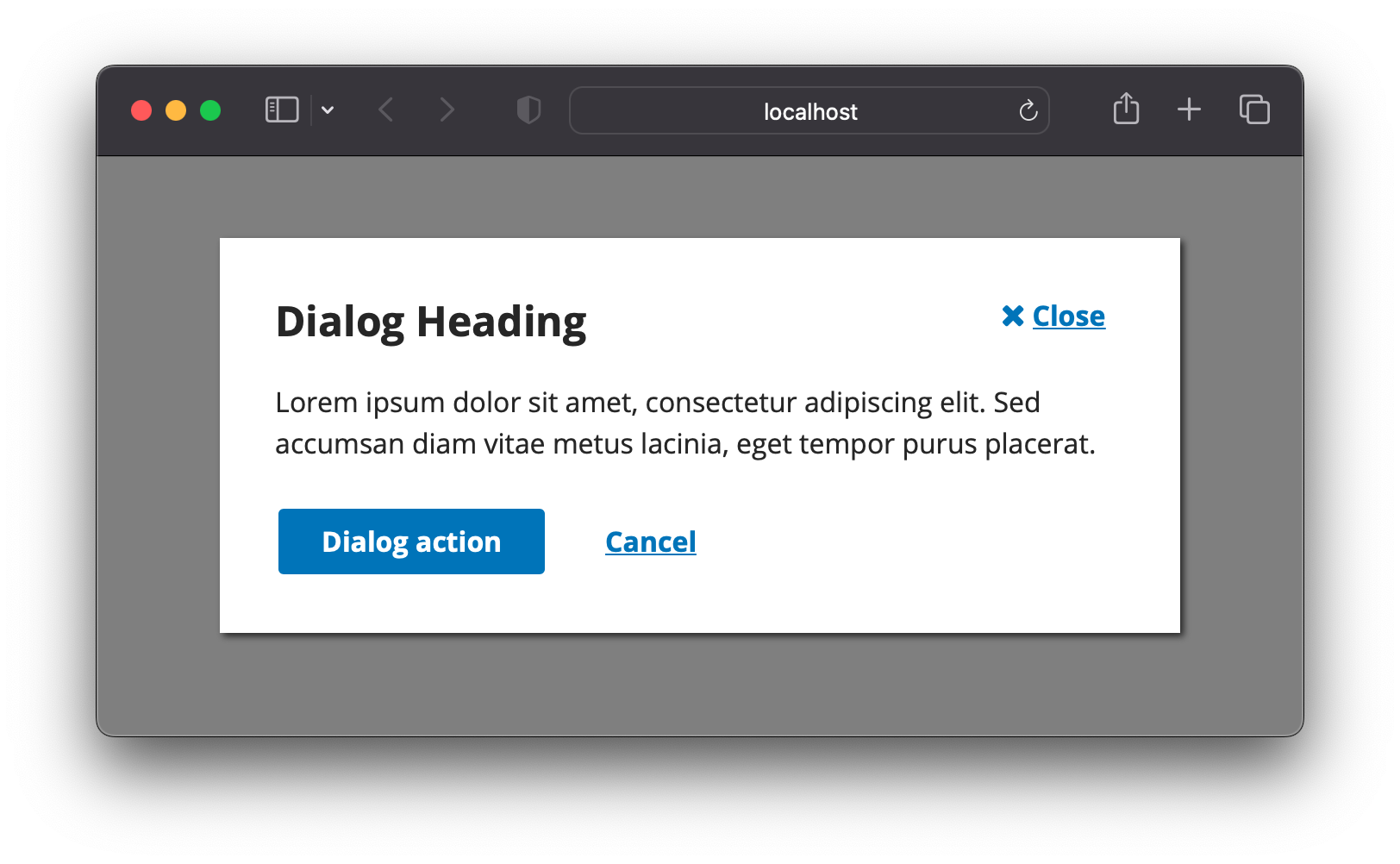
The Modal Dialog and Drawer components are now using the new HTML <dialog> element. There are no visual changes associated with this change, but it's a major tune-up under the hood.

Before the advent of a specific <dialog> element in HTML, web developers had to create the modal dialog experience themselves by dressing up non-semantic elements with custom CSS and JavaScript. This update will improve accessibility and remove third-party dependencies that we used to have to rely on. You can read more about the research behind the change in GitHub discussions.
Upgraded to React 17
We've upgraded our React library to React 17. This update will make future React upgrades easier for the design system while providing better support to teams already using React 17+. We tested this upgrade in several applications to ensure backwards compatibility, but if you have a problem, yo, we'll solve it. Create a Jira ticket and we'll resolve it.
Quality-assurance improvements
We made a few big changes to our automated testing tools.
- Migrated our automated accessibility tests (axe-core) away from testing our legacy doc-site examples to testing our much larger suite of Storybook stories.
- Added a11y tests to our continuous-integration job. That helps us validate all our code changes for accessibility as we make them.
- Finished converting all unit tests to use react-testing-library. While the goal of this was to make them compatible with React 17, the process also resulted in higher-quality tests.
- Rebuilt our visual-regression-testing suite to test all three themes of our design system on multiple browsers at multiple screen sizes.
Mamma mia, those are some thorough checks! All these things help us be more confident that we're providing quality components.
Sketch alert symbol update
We have consolidated and updated our alert symbol to take it from multiple alert symbols to a single alert symbol with optional overrides. The override panel supports standard and lightweight designs, changing the alert icon, and showing and hiding the alert heading and body. The simplified approach to the alert and the practice of utilizing layer styles more to achieve design flexibility is something we are going to continue weaving into other sketch symbols as we create and update them. Finally, this updated alert symbol now can easily adapt to small screen sizes without breaking the design of the alert.
Camilo Sketch plug-in discovery
We have been researching options for making our Sketch UI kits easier to maintain and scale. Currently, we maintain three UI kits for Healthcare, Medicare, and the Core Design System. Each time there is a change needed we have to make that change to the three different UI kits. This can be time-consuming and creates challenges when trying to replicate the exact symbol in different Sketch UI kits.

One of the more promising solutions to solve this problem is a plugin for Sketch called Camilo. It applies a theme to a single UI kit so you can have multiple brands use the same UI kit. The Camilo plugin has some issues that prevent it from being a solid solution for the CMS Design System. We are continuing to do some final explorations before closing the door on this option.
Feedback & discussion page
We are using GitHub Discussions to discuss topics about the Design System to promote more conversation and communication within pages of the Design System. Your feedback and input help pave the way for how the Design System grows and changes.
What's on deck
Sass/CSS changes
Product teams have experienced pain points consuming our CSS as Sass, so we explored alternative options for distributing our CSS. Sass has been the recommended method of importing Sass from the beginning of the design system, but we've run into serious obstacles with upgrading to newer versions of Sass.
To simplify how our styles are consumed, make it easier to override styles in applications when necessary, and better support those who do not use the Sass pre-processor, we've decided to stop distributing our CSS as SCSS files. We will instead only distribute CSS files and will export all our design tokens as CSS variables. Have thoughts? Join the discussion on GitHub.